Brief 3: Magazines and Online
You work for an independent media production company. You have been given the task of producing one front cover and the contents pages of the first two editions of a new real-life story magazine that is being launched by Bauer and two pages for the working website for the magazine.
Target Audience: A primarily 16-25 year old mass market audience that expects to be emotionally engaged.
The web pages must promote the new magazine to it's target audience and enable fans to interact with the content.
Production detail that must be included:
Magazine covers and contents pages:
- At least 4 different main images using original photography across the magazine covers and contents pages.
- Editing of magazine covers and contents pages (including photos, text, graphics, typography and layout).
- Written texts including elements such as the masthead, main coverline, selling lines, headlines, captions, subtitles and copy.
- Barcode, date, edition and price information on each front cover.
- A different use of mise-en-scene for each cover.
- Representation of at least two different social groups (e.g. as defined by age, gender, race and ethnicity, sexuality).
- A call to action pointing readers to the online website.
Wednesday 12th May 2021
Research: Codes and Conventions
L/O: To analyse similar products.
Magazine Analysis:
Two covers and two contents pages for:
- Genre codes and conventions - content & layout
- How house style is established/use of font/colour/images
- Representation - magazine & artists
- Ideology
- Production Values
- TA appeals/links
Cover 1:
Real life magazines use very bold and bright colours, despite the cover lines that feature on their covers. They use a lot of red's, yellows and purple here with a white font on top of the colours. The writing is seen in a white bold font which is mostly covering a plain block colour background with only occasionally having the text over the images. The background of this cover has a purple background and we can see that the main image has been cut out from another image, this suggests a lower production value because of where the image is not a studio taken image.
We see the brands masthead in a similar style to the cover lines, it uses the most commonly featured colour red and the classic more common white text. The masthead for the "that's life!" magazine is shown to us through a white serif font.
The main cover line, at least so it looks like the main cover line, is shown through the same white font and red background as the masthead. It looks like the main cover line since its the biggest in terms of font size and stands out the most. Along with being the biggest it has selected certain words that are in all capitals like what happened, who is involved and why it happened. These are most likely in capitals to stand out and are the words that shock people and help to draw peoples attention to buy the magazine and to read the article. The parts with certain words being capitalised does not just apply to the main cover line it also applies to the other more minor cover lines.
"that's life" magazines typically show other images from the main image. The images link into the cover lines which they are close to, this gives insight to the type of people who are involved within the article. This then allows people to picture certain situations before reading the article allowing them to develop an interest and a connection to the articles, whether that be emotional, humorous or just a general feeling of understanding going into reading the article.
The layout of the cover is very busy and there's a lot going on, this could reflect all that they write about e.g. the different things going on within society and the situations that are mostly featured on this cover with all the trouble and issues that people cause suggesting society is not positive but yet full of issues that need to be talked about in some way.
Monday 17th May 2021
"that life!" uses a puff to show that by buying the magazine we see that there are ways to connect with the magazines, rather than just reading a magazine there are ways for you to connect and have a chance at winning something. The puff used here suggests that by buying the magazine you have a chance to win 'big cash puzzles and prizes!' The puff has a similar colour background of the "that's life!" masthead with the red shape background as well as the white font but with a yellow font as well which matches the majority of the font on the front cover.
We can see that the "that's life!" magazine has a low production values, this is seen through the images being cut outs or taken from original images. We can also see that the price suggests that it has a low production value because if it had a higher production value they would charge more than 85p per edition. The layout also suggests that its of a lower production value as typically higher production value magazines use a limited text and photos. "that's life!" however uses a large amount of images and text which makes the covers look tacky as well as cheaply produced. Not only does the amount of things that are going on make it look low production value, the placement of the text and photos give off the effect that its not as well thought through and isn't as cared about, it's as though the people producing the magazines are trying to provide people with the magazines quickly and the design doesn't matter, as long as what they do can draw people in then how it looks doesn't matter.
The people who are most likely reading this magazine are those who value their family, they would more than likely have young children. Many issues of "that's life!" contain articles which involve children. The people reading them are more likely to be engaged with what they are reading if it can in someway apply to them, that doesn't mean that that the whole thing applies to them it just means that if an article says or mentions its about children and states an age then the person would know that it is in someway possible that it may happen to them or what happens to people like them or like those who they love who are around them.
Monday 24th May 2021
Cover 2:
'Chat' magazine uses very bold and bright colours, typically what real life magazines have.
'Chat' magazine uses bold colours like red, blue, yellow and pink to help allow the text to stand out. The red is used yet again as a background colour for the masthead which also has the typical white font used within it. The main text uses a mixture of capitalised letters and non capitalised letters in a sans-serif font. Any of the text used as cover lines have coloured backgrounds with white, yellow or red coloured text. The colour of the text stands out because of the colours used behind it not looking similar to the text colour.
The background of this magazine cover uses a yellow block colour background. You can tell yet again that there are no studio taken images, they all look cut out which suggests yet another low production value magazine.
In terms of the main cover line, but most likely isn't the main cover line, as many real life magazines don't look to have the most specific cover lines and when in the contents page it is far from the front and seems the least important, most likely used to keep you reading to find out. We can tell that it in some way has a lot more significance because of the way the colours match the masthead, this seems like an interesting choice of colours to use as they are the same as the masthead which suggests it is more connected to the magazine.
As with the 'that's life!' magazine there are many small images which supposedly go alongside the cover lines which they are closest or next to. From looking at many real life magazines, small images next to cover lines are very significant to know that its a real life magazine.
The layout of this 'Chat' magazine cover is very busy but quite well organised, the magazine cover seems a lot less overwhelming than the 'that's life!' cover which seems to be quite hard to follow and a lot more stressful. This could be to do with what the magazines talk about and who there aiming their target audience at. 'Chat' magazines target audience is based around providing some form of reading material every week for women, specifically those who are mothers or those who take care of people. We see a common stereotype featured of the front cover of this magazine and that being the fact that theres some kind of food advertised on the cover, since its a magazine cover and the magazine is targeted towards women it could enforce the stereotypes of women being the people in the kitchen cooking food and doing all the work in the house. We also see a lack of respect for males featured on this cover and it gives off a negative opinion of males in general. We see these in statements like 'My brother plotted to make me his wife', 'Sister raped and murdered in bed' and 'while I was helpless, he did something unforgivable', these all make men out to be terrible people, no where on the cover does it suggest men are kind and not made out to sound like a monster. Although this magazine is aimed towards women, men should still be represented in some sort of way that doesn't make them out to be monsters, the magazine also makes women seem like victims and makes them seem weak and vulnerable linking to stereotypes.
Although the cover isn't the most cluttered and disorganised looking cover for a real life magazine, you can still see that it has a very low production value. It is organised and not as cluttered as the 'that's life!' magazine but that doesn't mean its got a high production value, it still has quite a lot of text and the boxes make it look quite tacky as the text wouldn't show up how they want it to without it so its necessary to have the boxes to stop it clashing and blending in to much. Another thing is that the 'Chat' magazines image is not an image that has been taken in a studio, if the image had been taken in a studio it would have been a lot easier to avoid all of the boxes needed for the text.
Wednesday 26th May 2021
Contents 1:
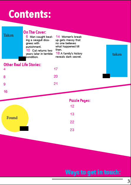
'That's life!' - Contents page (doesn't match cover analysis):The contents page of 'Thats life!' uses bold and bright colours like pink, yellow and blue. This links to the bold and bright colours used on the covers of the magazines.
The contents page for 'That life!' magazine uses shapes and rectangles which is similar to what they do with the cover. It's organised but there is a lot going on. You have different sections which provide where the stories are featured and if they've been featured on the cover, other true stories as well as where the puzzles can be found.
'That's life!' also has the links to where you can get in touch with them. Its in a bright pink which stands out and is stretched across the bottom of the page.
We see pictures which link to the other stories featured in the magazines which may come under 'more true stories' or 'on the cover'. The magazines have shown that there are different ways to engage the audience, the use of the photos may help to engage the audience just because of what the people look like who the stories about. The images also have the page numbers of where the story is featured within the magazine. The magazines content page also has a load of different things that you are able to win or enter alongside exclusive newsletter bonus which may be what people want to know.
From the layout of the contents page you can see that the production value of the magazine isn't very high. It looks cheap and tacky and is very crowded. The colours make it look less professional suggesting that it isn't serious and what everyone would find important.
The font inside, on the contents page, of 'That's life!' look to have a serif font, it is bold but doesn't look serious but at times it looks to be sans-serif. So, 'That's life!' uses a mixture of serif and sans-serif fonts depending on what elements of the contents page are using what elements.
Contents 2:
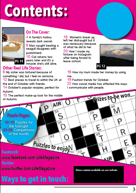
Chat magazine contents page (Links to cover 2 analysis):The contents page of 'Chat' magazine has a very similar colour palette to many real life magazines. Although its not visible in this photo the blues and pinks and the little tiny bit of yellow are the same colours that are featured on the cover of the magazine. These work well and stand out on the white paper and very common colours for a real life magazine.
Package 3 - 27/09/21
When starting to put the magazine together I decided to use shapes to help with the placement of text and to help to magazine to stand out like all real life magazines do. By the 3rd package and the 3rd lesson I'd decided on the font which I had wanted to use throughout my magazine to make it look conventional and like a real life magazine. By this time I've managed to take a few photos and had started to add them where I want them to be.
At this point the only thing I hadn't started or considered was a cover for the second issue.
Package 6 - 18/10/21
Note: contents pages didn't change.
By package 6 I'd added many elements, and decided to copy the layout from my first issue for my second after looking at multiple different real life magazines and coming to the conclusion that they tend to keep the same layout over all of the different issues, the only main difference in the colours used over the magazine. By this point I hadn't yet decided much in terms of what colours were to go where so the only main difference between them was the background colour behind the image. I also hadn't changed any of the contents pages by this point since I'd spent the time working on the front covers.
Package 9 - 19/11/21
There wasn't many changes between the front covers since package 6, I'd changed the month on the cover for the second issue and altered the colours. But since package 3 I'd managed to make a few changes to the contents pages including adding page numbers so that I had more of an idea of the kind of layout that I was going for.
Package 12 - 8/12/21
Since package 9, I'd added a main image which I'd taken myself and added some new cover lines. During these 2 packages I'd managed to plan out what images I was planning on taking or finding to continue adding and producing my magazine front covers and contents pages.
Package 15 - 9/02/22
Since package 12, I managed to think through what I was planning to put on the covers. I'd managed to change where the cover lines were going to go based on the photos I am still to take. I'd also changed some of my original plans with my layout on the covers, getting rid of the white circle at the bottom, since it didn't make sense to have it there. The barcodes have also changed positions due to them being more convenient at the bottom of the cover instead of the side of the cover.
Package 18 - 9/03/22
Since package 15, nothing changed on my first front cover. The contents pages and cover had managed to build up a lot more, however I'm not 100% sure on the image for the second cover. So I'm planning to try and get a new photo of someone else to use instead and use the image elsewhere. I also haven't managed to think of the second main cover line.
Package 21 - 30/03/22
Since package 18, the first front cover didn't change. The contents pages have been added to and the second front cover has been changed and now has a cover line. The contents pages also now feature drop shadows, to make certain elements stand out where they need to be a little bit more obvious.
Package 24 - 8/04/22
Package 24, the final package, shows where certain elements were changed because they were no longer useful or where they were placed didn't look right anymore and didn't match many genre conventions as many real-life magazines are full with little gaps. So to limit the amount of gaps and making it look more conventional, making certain elements bigger was the better option and adding the October and November to the contents pages made them match the covers of the magazines.


Comments
Post a Comment