Magazine progression
Package 3 - 27/09/21


At this point the only thing I hadn't started or considered was a cover for the second issue.
Package 6 - 18/10/21
Note: contents pages didn't change.


By package 6 I'd added many elements, and decided to copy the layout from my first issue for my second after looking at multiple different real life magazines and coming to the conclusion that they tend to keep the same layout over all of the different issues, the only main difference in the colours used over the magazine. By this point I hadn't yet decided much in terms of what colours were to go where so the only main difference between them was the background colour behind the image. I also hadn't changed any of the contents pages by this point since I'd spent the time working on the front covers.
Package 9 - 19/11/21


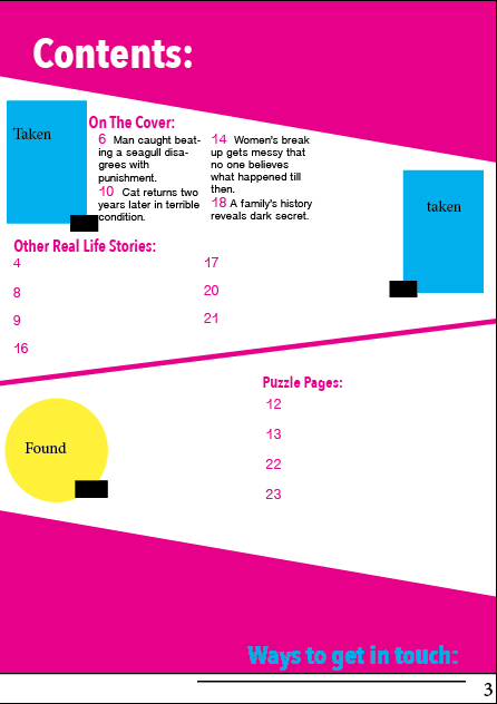

There wasn't many changes between the front covers since package 6, I'd changed the month on the cover for the second issue and altered the colours. But since package 3 I'd managed to make a few changes to the contents pages including adding page numbers so that I had more of an idea of the kind of layout that I was going for.
Package 12 - 8/12/21


Since package 9, I'd added a main image which I'd taken myself and added some new cover lines. During these 2 packages I'd managed to plan out what images I was planning on taking or finding to continue adding and producing my magazine front covers and contents pages.
Package 15 - 9/02/22


Since package 12, I managed to think through what I was planning to put on the covers. I'd managed to change where the cover lines were going to go based on the photos I am still to take. I'd also changed some of my original plans with my layout on the covers, getting rid of the white circle at the bottom, since it didn't make sense to have it there. The barcodes have also changed positions due to them being more convenient at the bottom of the cover instead of the side of the cover.
Package 18 - 9/03/22


Package 21 - 30/03/22


Package 24 - 8/04/22


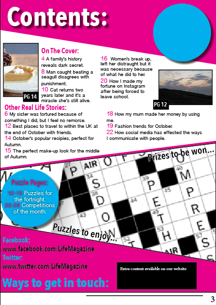
Package 24, the final package, shows where certain elements were changed because they were no longer useful or where they were placed didn't look right anymore and didn't match many genre conventions as many real-life magazines are full with little gaps. So to limit the amount of gaps and making it look more conventional, making certain elements bigger was the better option and adding the October and November to the contents pages made them match the covers of the magazines.


Comments
Post a Comment